Design System Alignment: Updating a Shared Figma Component Library
This case study has been approved for external sharing. Certain details have been omitted or generalized to protect proprietary processes, confidential client data, and sensitive business information.
Overview
The shared Figma component library served as the design foundation for a web platform that was continuously evolving. As the platform changed, the components in Figma were not always updated alongside it, creating a growing gap between the components designers were using in their files and the components currently implemented in the web platform.
This misalignment became especially apparent during design-to-development handoff. A designer could use a component from the shared library that no longer reflected the current standards, resulting in discrepancies between the design and the working platform. These discrepancies could require additional clarification and rework, ultimately slowing the handoff process.
The project focused on bringing high-priority Figma components back into alignment with the current web platform and design standards. The goal was to create a more reliable shared resource that designers could confidently use, and developers could reference during handoff.
Because I was working within a limited internship window, components were prioritized based on impact rather than attempting to update the entire library at once.
Why Design Systems Matter
A design system acts as shared infrastructure for the teams building a product. When its components accurately reflect the current product, designers can work from established patterns and developers can interpret handoffs with greater confidence.
When the system falls behind, that shared foundation becomes less reliable. Designers may unknowingly use outdated patterns, while developers encounter discrepancies during handoff that require clarification or rework.
Maintaining alignment between the design system and the working product helps prevent these inconsistencies from accumulating and keeps the system useful as the product evolves.
The Problem
Over time, the shared Figma library had drifted from the design system it was meant to represent. Components no longer reflected current patterns and standards. Designers risked unknowingly using outdated components that wouldn't surface until handoff, causing delays and rework.
The team was also operating near max capacity with projects, leaving little bandwidth for the maintenance work the library needed. The longer the drift continued, the harder it would become to trust the library as a shared resource.
Users & Audience
This project primarily benefited the UX designers using the library daily for mockups and handoffs. However, this had a downstream positive impact on other teams. Front-end developers received consistent and accurate materials, which reduced any ambiguity of components not aligning with the system. All teams and end users benefit from a standardized library that is used consistently throughout an application or product.
My Role
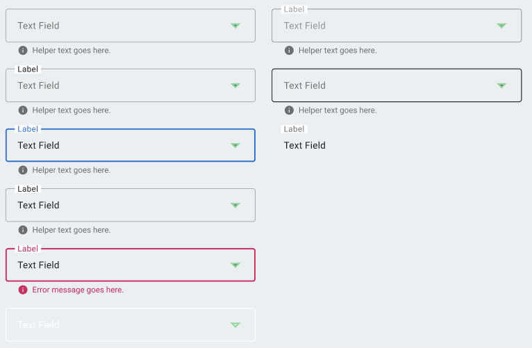
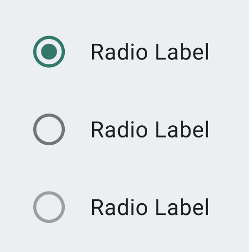
I collaborated with a senior UX designer to identify high-priority components that were not adhering to design system standards. I reviewed each component and made updates as needed, including fixing variants, states, naming conventions, typography, colors, and patterns to align with current standards. Some components needed only minor updates to align, while others were outdated enough that I redesigned them entirely as new components to match the application.
Scope & Constraints
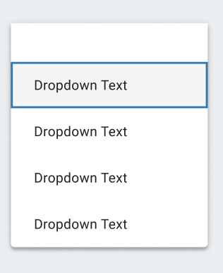
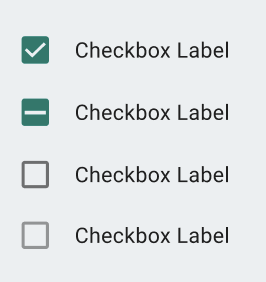
The project covered several components across common UI patterns, including buttons, form fields, dropdowns, tables, accordions, and more, while ensuring variants, states, and styling were consistent. Several real constraints shaped how I worked. The internship timeline was fixed, which meant everything had to be prioritized rather than exhaustive. Limited access to internal systems due to security and the scope of the internship also required me to identify workarounds to get the work done efficiently. These constraints made prioritization one of the most important skills on this project.
My Process
Step 1 - Receive & Review: The lead UX designer identified components that needed attention and provided direction on what required updating. I reviewed each component to understand the scope of changes needed before beginning any work.
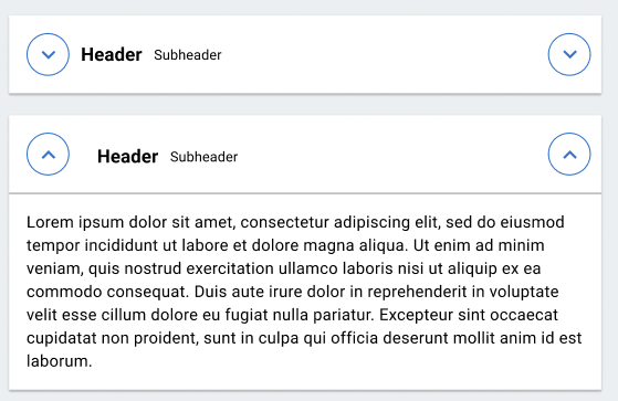
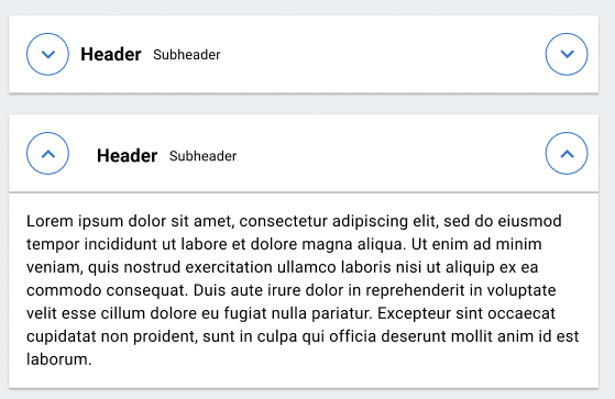
Step 2 - Problem Solve & Update: For each component, I determined the best approach to bring it into alignment, deciding if that meant small corrections or a full rebuild. I updated variants and interaction states (hover, focus, disabled, error, etc.), standardized spacing, typography, and color, and cleaned up naming conventions to improve consistency and discoverability. Many updates were structural rather than visual, such as correcting state coverage, naming conventions, and spacing to align with current standards. The components below are the exception, where the visual itself required a full rebuild. Full rebuild example shown below.
Before: Accordion with limited function
After: Accordion with updated typography, coloring, spacing, and drop down function


Step 3 - QA Checks: After updating, I spot-checked components in sample files to verify they behaved correctly across states and matched current system standards.
Step 4 - Communicate & Hand Off: Weekly check-ins were essential for staying aligned. I shared my progress, explained my approach, asked questions, and incorporated feedback before finalizing any updates. This kept the work on track and made sure every update was validated before moving on.
Outcomes
-
Successfully updated several components, including buttons, form fields, dropdowns, tables, and accordions.
-
Improved consistency across high-priority components most likely to cause handoff issues between designers and developers.
-
Rebuilt several components where existing versions had drifted too far from current standards.
-
Delivered all updated components back to the lead UX Designer with changes communicated verbally through weekly check-ins.
-
Left the shared library in a more reliable and trustworthy state for designers and developers building on top of it, and for future work.
What I learned
Keeping a shared library accurate requires the same skills as any design project: research, prioritization, communication, and iteration. I learned that consistency at the component level builds into efficiency across several teams. Communicating changes matters as much as making them, and good design system work leaves things better for the next person, not just for right now.